We may receive a portion of the sale if you purchase a product through a link in this article.
Home should feel like a sanctuary. I always want to feel a sense of peace and calm as soon as I walk in my door—especially after all the hustle and bustle of what’s going on outside. Yes, your home can evoke any feeling you like, but at the end of the day, home is where we relax. It’s where we wind down after a hard day’s work, where we lounge around in our pjs on lazy Sundays, and where we drift off to sleep and wake up each day. Having a home that exudes calm is a great goal for the new year, and there’s one sure way to help you get there: color.
Top Color Predictions for 2026
There’s no denying that color affects our mood and well-being, and the 2026 paint color trends show us that we’re all looking to cool down. “Homeowners want comfort and stability, and they will look to create this in the home in particular,” said Carolyn Fife Bever of Foundry-House. “The future of paint colors is a big warm hug from nature: comforting, familiar, and focused.”
Designers reach for warm neutrals, soft blues and greens, and desert-inspired tones meant to help you feel relaxed. Ahead, interior designers share their favorite paint trends for 2026 and how to create a sense of relaxation in every room.

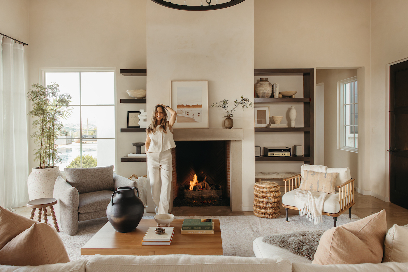
Warm Neutral
Cool gray used to be the it neutral years ago. With the inclusion of “millennial gray,” the tide has turned, and warm neutrals continue to rule. “Instead of cool grays, we’re seeing a shift to warmer neutrals, such as mushroom taupe, soft stone, or warm beige,” shares Daniele Doerge, color expert at California Paints. “These colors are timeless, and can create a space that feels comforting rather than cold or stark.”
If you think neutrals feel lonely, Lauren Lerner, founder and lead designer at Living with Lolo, suggests otherwise. “Warm neutrals create an inviting backdrop that allows design, material, and texture to really shine,” she says. Colors inspired by limestone, sand, clay, hardwood or mushrooms seem timeless to me because they are based on nature, not trends.”
Finishing paint can also create a sense of calm, especially when working with warm neutrals. “You’ll see high-gloss paints throwing sunlight into rooms, especially in warm paint colors like Broccoli Brown by Farrow and Ball and Creamy by Sherwin-Williams,” adds Fife Bever.

Greige
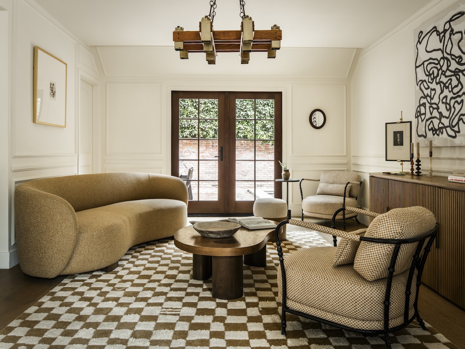
If the gray keeps calling you, all is not lost. 2026 paint color trends include a warm, creamy greige-gray that doesn’t include cool, solid tones.
“As we look ahead to 2026, I recommend warm greige for its calming, grounding qualities,” says Erica Yaw, Lead Designer at Rumor Designs. “With cool grays coming out, this neutral feels fresh, clean, and welcoming without any yellow or modern undertones.”
Current interior design trends embrace unique, highly personalized spaces, and Yaw explains that greige works in both cool, relaxed spaces and those that are a little bolder. “I applied this color to both the walls and ceiling of the living room, creating a warm and welcoming space while providing a neutral base for bold design elements, such as blue lounge chairs, a metal fireplace, and a bold rug,” she says. “The result felt rich and inviting, the warm greige encompassing every part of the space.”
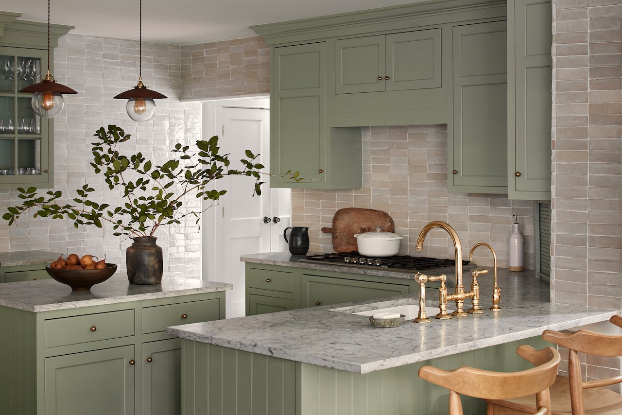
Eco-friendly Green and Blue
There’s a reason that green forests and sun-drenched waters make us feel relaxed. Being in nature calms us down, so it makes sense to use similar calming paint colors in our homes. “Landscape vegetables continue to lead in 2026 because they create that immediate connection with nature,” explains Doerge. “These tones feel stimulating and relaxing, making them perfect for living rooms, bedrooms, or anywhere one wants to promote calm.” As for what shade of green? “Deep greens like Benjamin Moore’s Dakota Woods Green will be warming up study rooms and lining kitchen cabinets,” predicts Fife Bever.
The same goes for soft blues. “The secret to calm paint that will be popular in 2026 is to choose a color that mimics natural light,” says Leigh Falkner of Leigh Falkner Interiors. “A space with few windows, especially a bedroom, can be enhanced and muted with the light aqua color Pale Powder #204 by Farrow and Ball.”
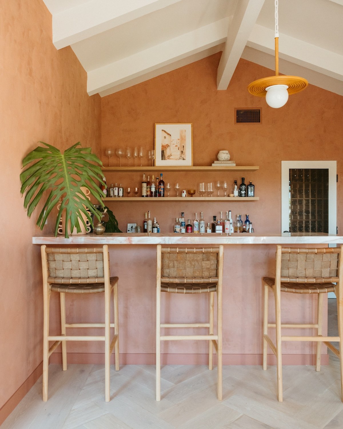
Desert Inspired Colors
Camille is the queen of desert color palettes, and it’s no surprise that they’re trending in a big way this year. “We’re seeing a lot of play with clay, terracotta, and ‘sunburn’,” Doerge said. “This brings warmth and calm to the space, while still encouraging color for those looking to add different tones to the room.”
“Clay, putty, soft terracotta, and warm charcoal feel incredibly earthy,” added Lerner. “They calm down because we already associate them with outsiders, so they create equality instead of seeking attention.”
Desert-inspired neutrals are also incredibly flattering—and who doesn’t want to both look and feel good in their space? “When I visited a spa with beautiful concrete walls painted like Farrow and Ball #231 Setting Plaster, I noticed that the color complements a variety of skin tones—promoting a pleasant experience for all,” shares Falkner. “As an additional option, this color can be satisfactorily softened to the touch by mixing at 75% intensity.